
![]()
![]()
![]()
![]()
![]()
![]()
![]()
![]()
![]()
![]()
![]()
![]()
![]()
|
158 Lee Avenue ph: +1 416-691-2516 info @ archimuse.com Join
our Mailing
List.
published: March 2004
|

The Blind Leading the Sighted: Accessibility Case Study of an On-line Audio Museum
Matthew Nickerson, Southern Utah University, USA
http://archive.li.suu.edu/voice
Abstract
After completing a successful multimedia museum exhibit and receiving accolades from local, regional, and national audiences I was forced back to the drawing board when a hearing impaired friend asked,"What was that all about?" This case study briefly outlines my efforts to re-educate myself by creating the Web's first museum exhibit featuring nothing but audio artifacts. My goal was to focus primarily on the visually impaired audience and along the way make an exhibit that was universally accessible and enjoyable by all Web patrons.
Keywords: Accessibility, visually impaired, Web Content Accessibility Guidelines, audio, multimedia
Introduction
In 2002 I completed a successful on-line multimedia museum exhibit featuring historical images and first person narration from oral history collections. The collection of mini-documentaries were created using Macromedia Flash. The combination of sound and images on the site worked very well and received great reviews from professionals and lay people alike. After its official release I had many opportunities to present my work at national and international meetings where it was positively received, and we continue to get great reviews from our on-line patrons to this day. It was not until I demonstrated it to colleagues here at home that I really came to grips with accessibility issues I had not paid enough attention to previously. A good friend and colleague who is hearing impaired, an artist with considerable museum and gallery experience, attended my in-house presentation and afterwards commented,"What was that all about?"
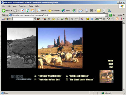
Figure 1: Multimedia exhibit from original Flash-based site
Though pleased with our work on the multimedia exhibit, I had to face the hard question of universal accessibility and reevaluate our site in the stark light of Section 508. Taking her advice, I immediately set about close-captioning the original site, and this simple addition not only made the exhibits infinitely more useful to the hearing impaired, but many users of all kinds also found the close captioning a helpful and valuable tool when listening to foreign born speakers or when the sound quality lagged. When I looked to other un-accessible points of the site, corrections were not as simple. I struggled to find ways to offer command key control of the Flash movies, to create voice links on the automated map menu, and to embed adequate descriptors for the historic photos and other images. As a confirmed Flashaholic I found it increasingly difficult to"accessible-ize" the existing site, and I decided to make a fresh start.
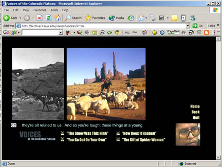
Figure 2: Original exhibit with closed-captioning
To force myself to more directly address accessibility issues I began by experimenting with an on-line museum exhibit where sound takes precedent over sight. Realizing full well that there are a wide range of disabilities among Web users and that many physical, emotional and learning disabilities can effect how a patron interacts (or cannot interact) with the Web, for this experiment I chose to focus my attempts on the blind and visually impaired. I was not attempting to create the ultimate in accessible Web sites; instead I wanted to learn first hand and in some detail both sides of the Web accessibility equation from the point of view of both the creator and the user. With so many Web patrons and so many accessibility issues, I chose one for the crux of this informal hands-on study.
Accessibility Basics
There is considerable information on Web accessibility in the professional literature and on the Internet. The World Wide Web Consortium (W3C), founded in 1994, lists Universal Access at the top of its primary goals, and the consortium created the Web Accessibility Initiative in 1997 to address this important issue. Their Web Content Accessibility Guidelines (WCAG 1.0) were first released in September of 1998 and have served as a foundation for accessibility work around the world ever since. In the United States, section 508 of the Reauthorized Rehabilitation Act drew heavily from the work at WAI and similar legislation, and guidelines established in other countries likewise derive from this important source. The rapid growth and evolution of the Internet has made this an ongoing service of WAI, and WCAG 2.0 is already in the works. Because WCAG 1.0 was designed specifically for HTML it is sometimes difficult to extrapolate the guidelines when working with some of the newer, more complex tools currently available. WCAG 2.0 is a more streamlined and generalized document that is technology neutral and deals with accessibility in a more conceptual way than WCAG 1.0. The WAI plans to support WCAG 2.0 with Techniques Documents peculiar to specific technologies such as HTML, Flash, PDF, etc. These will be very helpful and important for designers using multimedia and other leading edge Web technologies.
These documents, including the current draft of WCAG 2.0, can be found on the W3C Web site and also at WebAIM, another valuable accessibility resource. W3C Web Accessibility Initiative and WebAIM are two expert institutions with excellent information for both beginners and more advanced Web administrators/designers. Perhaps the best concise outline for accessible design is the Quick Tips, from WAI. These ten points are a recognized standard across the globe. First introduced in 2001, it continues to be the place to start when accessibility is the question.
Quick Tips
- Images & animations: Use the alt attribute to describe the function of each visual.
- Image maps. Use the client-side map and text for hotspots.
- Multimedia. Provide captioning and transcripts of audio, and descriptions of video.
- Hypertext links. Use text that makes sense when read out of context. For example, avoid "click here."
- Page organization. Use headings, lists, and consistent structure. Use CSS for layout and style where possible.
- Graphs & charts. Summarize or use the longdesc attribute.
- Scripts, applets, & plug-ins. Provide alternative content in case active features are inaccessible or unsupported.
- Frames. Use the noframes element and meaningful titles.
- Tables. Make line-by-line reading sensible. Summarize.
- Check your work. Validate. Use tools, checklist, and guidelines at http://www.w3.org/TR/WCAG
In the course of developing my original multimedia site I had run into all of these concepts numerous times, but I found that implementing some of the guidelines were at odds with my grand multimedia vision. I believe this is a common occurrence for most conscientious designers. More often than not I relaxed accessibility guidelines to make way for my multimedia design and content. In hindsight, I realize that I had a good general understanding of many key Web accessibility issues but, as my deaf colleague had reminded me, I still had a lot to learn in order to bring awareness into practice.
On-line Audio Museum
To bring accessibility issues to the forefront I began work on an on-line museum exhibit that would highlight the audio oral history selections of the original multimedia museum site. I envisioned this exhibit as the Web's first audio museum, where all the artifacts in the exhibit would be sounds. The design foci for the first site: graphic design, page lay out, control bars, typography, animations, color scheme, etc., were all put aside. Instead of a standard Web browser, as I built the new site, I reviewed my progress using two alternative browsers: 1) IBM Home Page Reader, a Web page reader for the visually impaired, and 2) the popular screen reading software JAWS from Freedom Scientific. Most of my previous design work was all about "the look," so my new site focusing on the visually impaired would free me from previous constraints and assumptions. This time I purposely erred on the opposite extreme working to create an on-line museum experience that required a visitor to have a sound card and a media player but not a monitor.
Since my hearing impaired colleague had been so forthright and helpful, I decided I needed similar expert assistance with my new site. At the outset of my project I contacted several blind user groups in major cities to seek advice and to recruit on-line reviewers for my experiment. I sent my first queries to on-line bulletin boards hosted by six regional user groups for the blind in different parts of the U.S. My first e-mail was rather general, including a cursory review of my idea and a petition for volunteers. I received immediate encouragement from several respondents saying the audio museum was "a superb [idea] and one that would not be difficult to implement" and calling it "an idea well worth pursuing." With their encouragement I began the chase.
Led by the Blind
My initial trial was very stark with a white background, black text, and no images. The simplicity made programming easy with so few tags and no exceptions to worry about. I used <no frames>, removed all the tables, and simplified the menus into vertical lists. I did not need so much as a single ALT tag to keep the site compliant and to sail through validation tests.
Figure 3: Exhibit from the first draft, plain and unadorned
Because audio was the key to the project, I researched formats and players to find a combination that would be efficient to distribute and that could provide multiple means of control. Research at WebAIM gave the nod to MS MediaPlayer as most accessible. Though my entire original site had used RealPlayer technology, I converted all of the audio clips to MediaPlayer format for the new site to match the preferred player and to provide as much control to the end user as possible.
When my test site was up and running, I asked my volunteers to have a look. I received several enthusiastic responses, and my reviewers proceeded to educate me about real-life-accessibility in the trenches; it was literally the blind leading the sighted. I remained in contact with my talented and conscientious reviewers throughout the re-development process. Developing the site under the "watchful eye" of the visually impaired was very enlightening.
Navigation
I was gratified that my bare bones creation got high rating for navigability. Most reviewers mentioned this aspect of the site, and their comments led me to believe that this was an exception on the Web rather than the rule. This comment was typical, "I found [the site] to be very easy and enjoyable. I was able to navigate and listen to what ever I wanted." Two aspects of the experimental site which differed from the original site made all the difference.
First, the original site was all Flash based, so menus and links could not be controlled with key strokes. Creating an html based site that linked to the audio media gave me key board control of the same audio media. Second, the simple advice from the WAI Quick Tips to make hyper links text complete and understandable when "read out of context" was also important. Simply including the phrase, click here inside the link description did the trick for me. For example, instead of a button that simply reads Main, a fully descriptive link might read click here to go to the Main Menu. A good lesson for me: often simple changes make big differences.
Layout and Design
One of the first comments to really catch my interest was from a reviewer in Pittsburgh saying, "Don't avoid visually appealing layout issues in anticipation of blind users…Breadth of appeal makes the site much more vital and vibrant." I had encountered this type of advice before from conference presentations and the literature, but had not taken it to heart. Hearing it from a sighted user didn't convince me. While it is easy for a sighted author or designer to say visual elements are always important, it was quite a different thing for me to hear it from a blind reviewer! In the course of the evaluation, several other reviewers had similar comments. This was sound advice, and I immediately began work on a new more visually appealing design that would still offer open and easy access for the visually impaired.
Reviews on the layout and design also taught me to appreciate the variety of blind users out there on the net. When, for clarity's sake, I focused my experiment specifically on visually impaired users, I never imagined the wide variety of impairments that exist inside this specific group. There are many levels or degrees of impairment among blind users who rely on screen reading software to navigate the Web. Many such users have some level of useful vision and often use a combination of screen reader and screen magnifier to interact with Web sites. Well-organized page layout can be very helpful to them as they get a feel for the page and understand where to focus their magnifier to find what they need. One such user who viewed my page gave me this advice:
I have some useful vision, and use JAWS in tandem with a screen magnifier called ZoomText. I'm definitely not alone among the blind users out there. Though "blind" for all intents and purposes, extreme screen magnification makes it possible for those of us with some useful vision remaining to "see" the page, albeit in an unusual manner.
Through feedback from my reviewers I discovered that a well-organized and thought-out design is important to visually impaired users, and generally speaking a nice layout that will attract sighted users will benefit them as well.
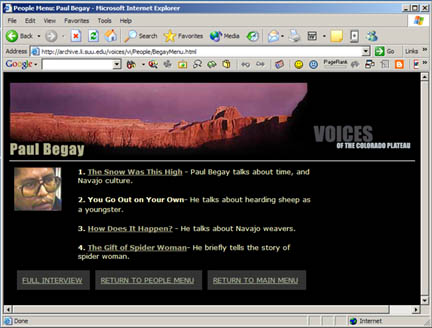
Figure 4: Improved exhibit implementing advice from visually impaired reviewers
Text
Another oversight on my accessible page was not paying attention to header tags. When creating the short introductory paragraph on the home page I inadvertently inserted <h1> tags at the beginning of every line. This type of error is hidden when designers use WYSIWYG editors and never check the source code. To the visual user and my cursory visual inspection, the page looked fine. When interpreted through JAWS, each heading tag is read aloud by the screen reader. So with each line having its own header tag, the screen reader would interrupt the narrative flow of the page by saying “Heading Level One” at the beginning of each new line. What a distraction! One reviewer went to great pains to elucidate this error and explain the havoc it wrought on his understanding of the page.
When no evaluator mentioned the fonts, colors or other text details on my pages, I sent a query to a partially sighted reviewer asking his opinion about use of text and how best to use contrast to help users with some but not full sight. He expressed a strong preference for lighter fonts on dark background but hastened to remind me that he knew other users that benefited from the opposite. Though only his personal view, his further commentary is interesting. He spoke very highly of the technical abilities of most visually impaired users. His advice to me was "font formatting is irrelevant" to most of the visually impaired because their disability has led them to be much more proficient in organizing their own browser than most other Web surfers. They configure their monitor/display to reflect their own needs and preferences, overriding text size and color as they see fit.
He recognized that there is a small but growing number of people with age related visual impairments. As a Web designer himself, he knew that a large percentage of this minority group are not computer savvy and are not seeking the technological help that is available. Having to draw the line somewhere, even in his own work, he admitted to designing Web applications for the "enabled" blind community, realizing you simply cannot please everybody all of the time. This was not an excuse or a cop-out but a statement of fact, and I appreciated his honesty in sharing with me.
In my revised site, I kept the light text on black background I had used in the original design.
Sound
Because sound was the central feature of the original multimedia site, I did not concern myself with this aspect of the new experimental audio museum. After all, it was my confidence in the power of the first person narratives on the site that led me to the idea of an audio museum in the first place. I was quite surprised when blind reviewers began reporting that the audio was insufficient, unclear or poorly done. Upon review of the sound files, I realized that some were of very poor quality.
My surprise that the blind users were not happy with some of the sound was partly due to my ignorance and shameful stereotyping of my audience. Weren't blind people supposed to have better hearing then us poor sighted folks? True or not, they certainly won't put up with poor quality anymore than any other knowledgeable and interested audience. One very kind reviewer even apologized for pointing out my sub-par performance
I had trouble hearing clearly the person who was describing his encounters with Butch Cassidy. For other interviews could you have the person being interviewed wear a mike? Don't get me wrong, I thank you for what you are doing. This site is really great.
I appreciate her encouraging words but with all due respect to her, if the audio was so bad even the existence of a microphone was in question, I was not distributing a quality sound product!
I had spent hours and hours with all of the sound files on the site, and I knew that some were not perfect. When the audio was coupled with the often stunning historic photography on the multimedia site, I found I was willing to overlook some of the sound flaws. But when the audio had to stand alone, with no eye candy to mask it, I realized the negative impact that the poor quality sound had on the new audio site and on the original multimedia site as well.
Images
As described earlier, one of the most important things I learned through this process was the need for a good clean layout that would work for all users. With this revelation came a need to redesign the site adding graphics that would improve the look and contribute to the organization. As I added images judiciously, I made sure to include an ALT attribute with each image. I learned from my blind reviewers that filling (or not filling) the ALT attribute is not enough and that discriminating programmers can learn to be more expert in the use of this important accessibility tool. Three examples from my test site must suffice here.
One: I was taught that typically an ALT attribute 1) describes the graphic or 2) tells its function or sometimes 3) does both. Realizing the multiple functions the ALT attribute can fill helps the designer to use the appropriate function at the right time. My pages included a banner graphic across the top bearing the name of the site Voices of the Colorado Plateau - and I had used a functional ALT attribute that described its purpose "Page Title." A reviewer patiently pointed out that this was too general to convey sense to the blind user. He suggested a descriptive ALT attribute reflecting the words on the banner (words in a graphic image cannot be read by screen readers) would be better or even a combination so the blind user gets both a sense of the layout and the name of the site at once: Page Title: Voices of the Colorado Plateau.” This brief tutorial taught me that ALT attributes and similar Quick Tips are not just obligatory blanks to be filled but are important design tools that can make a distinct difference when used with skill.
Two: When made as a conscious design choice with full understanding of the ramifications, there are occasions when it can be appropriate to leave the ALT attribute blank. Most screen readers, including the market leader JAWS, will skip over an image if the ALT attribute is empty. This is good practice when the image is not integral to the content. For example, a designer could leave the ALT attribute empty on a horizontal line graphic. This choice would not limit the visually impaired user's understanding of the page and would allow the screen reader to move across that point without verbalizing a superfluous ATL attribute such as "horizontal line." An empty ALT attribute is not the same as skipping the ALT attribute altogether. The designer must include the attribute and enter open/closed quotes after the equal sign: <ALT=””>
Three: An important lesson learned regarding images is the re-inclusion of photos on the new improved site. The original multimedia site included a wide variety of photos, including portraits of each of the oral history interviewees. When my visually impaired reviewers began calling for more graphics, I returned to putting the portraits of the individuals on the pages that offered access to their personal stories.As in the general layout, I was surprised that visually impaired users approved of the addition of photos when they appeared on the improved second draft. One enthusiastic blind user began his subsequent e-mail, "Now it's beginning to come alive!" Even though many users could not see the image, just knowing that the page featured a real face of a real storyteller made the history more concrete - a principal goal of the original multimedia project. I wanted this site to carry the same person-to-person feel as the original site, and I was very pleased to hear that the flavor persisted in the new audio museum version. In reference to the photos one reviewer commented, "In an indescribable psychological sense, the blind individual participates in the seeing of this graphic image in a way." I got this same sense of seeing from reviewers' comments about the importance of layout. The blind seem to be describing a virtual page they can construct in their mind's eye according to the verbal description provided by the screen reader. This virtual or mind page may or may not precisely reflect the page on the computer screen, but it is imperative that the mind page be as orderly, understandable, navigable and aesthetically pleasing as the actual page is to the sighted user.
Conclusion
I know that visual problems are only one of many impairments and disabilities that require our attention when we are creating a cultural heritage Web presence. My focus on the blind user for this study was not to trivialize or overlook the needs of all users; rather, it was an attempt to understand accessibility issues in general through working for and with one specific subset. The project made me acutely aware of what blind users need on the Web, and again the myriad barriers they meet everyday off the Web and in the world.
While I was writing this case study, some part of my mind still pondered the questions and issues this accessibility experiment had raised. I discovered that my vocabulary is as sight-centric as my Web design had been. As I wrote, my subconscious was constantly pointing out common words and phrases I was using that referred directly or indirectly to sight and the sighted. I used the word looked when investigated might have been more accurate; I referred to point of view when I simply meant perspective and I had blind reviewers taking a look at my site when what I really needed was an evaluation, and so on.
I realize now more than ever that all Web users appreciate our efforts when we act in good faith to create accessible Web pages to bring our valuable and vital cultural heritage to the Internet community. Our efforts are having an impact, and our contribution will grow as we expand our technological repertoire to embrace as large a world community as possible. As one of my reviewers pointed out, we are even giving bricks and mortar museums a run for their money. Who knows: maybe olfactory Web tools are just around the corner.
The idea of an on-line museum is a wonderful one! Visual impairment is greatly reduced in a true experiential way by the computer-based access technologies of this age. I often find myself wishing I had access to my computer when visiting exhibits of various sorts: there is no JAWS there to describe an image, or re-read something that wasn't quite audible. An on-line exhibit is only lacking those wonderful old smells (and) the feelings of the guy next to you as he reacts to something of interest.
Acknowledgements
Of the many kind people that responded to my original call for help I owe special thanks to four patient reviewers who spent extra time and effort to educate me.Jim Shaffer, Vickie Vaughan, Bill Teale and Jeffrey Filder. Thank you.