Sarah Beecham, Art of Memory, and Graham Howard, System Simulation, United Kingdom
Abstract
The Story of Glass has now been running in the Victoria and Albert Museum in London and the Corning Museum of Glass in New York since 1993. It continues to add visitor value to these collections. We describe how The Story of Glass came into existence, what the nature of its production was, how it has succeeded, and where it could be improved. We illustrate some of its significant design features, including the use of innovative ideas like crumb trail and video icons, as well as its overall content architecture. We consider the quality of the production values used, and we draw out the lessons learned into a series of recommendations.
Keywords: Content architecture, innovative design, sustainability, high production values, interaction design, creativity, databases
Introduction
The Story of Glass was one of the earliest interpretative interactive media products in a major museum. Installed in 1993, it continues to run in both the Victoria and Albert Museum in London and the Corning Museum of Glass in New York today.
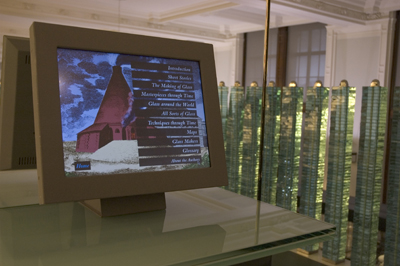
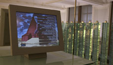
Fig 1: The Story of Glass installed at the Victoria and Albert Museum
The project which resulted in The Story of Glass was initially made possible because the Glass Gallery at the Victoria & Albert Museum in London was being completely refurbished. Located on the third floor, and relatively little visited, it aroused a real desire on the part of Oliver Watson, the curator of Ceramics & Glass, to create a new, dynamic environment for this specialised collection, and part of his vision was to give visitors a real understanding of how glass was made, in order to help their appreciation and understanding of the works displayed in the cabinets before them (Watson 1997).
His first wish had been to have a glassmaker’s kiln installed within the gallery, enabling live demonstrations to take place, but, inevitably, in a Grade 1-listed building this option was a complete non-starter. Plans were already underway, and funding was in place, for the gallery refurbishment when Art of Memory, by chance, were invited to give a demonstration to a small group of staff to show ‘what multimedia was about’. Oliver was one of that audience and immediately realised that here was a means to present in a meaningful and engaging way the important information that he wanted to convey to his visitors. As a result of that revelatory moment we began talking together to work out ways and means to make it happen.
We came with the experience of having done some research projects (Howard 1990, 1991) which had considered other cultural objects; for example Shakespeare’s Twelfth Night, and how one could unpack these using the new multimedia technology. From these starting points we sat down together to think about what the possibilities were, what stories needed to be told, and what the important things that we needed to elucidate for people were (Yates 1969).
Before we created The Story of Glass there were no obvious exemplars of interactive media products in museums. We had to ask questions. What would work? Who was it for? What would be useful for? What would make a difference to the new glass gallery in the V&A? How it would operate?
One of the issues with the old glass gallery was that it was undifferentiated, from a visitor point-of-view. It was the result of previous curatorial policy which saw the labelling of objects by museum numbers as totally adequate because it was felt that if you knew enough about glass, you would understand what the museum numbers were telling you and you would perfectly understand what you were looking at. The assumption included in this view was that the only audience would be experts in the subject. This elitist attitude was obviously not going to encourage those who didn’t know about glass to investigate and explore the area.
The whole concept of new technology had to be ‘sold’ to the museum. Our initial solution to this was to agree to make a speculative demonstrator which we then lent to the Ceramics and Glass department for two weeks, with one of our machines, so that staff could show it to as many others as possible, and hopefully win them round to seeing that this could provide a very useful tool. It seems extraordinary now, such a short time later, that just over ten years ago the idea of including a multi-media kiosk within a collection’s gallery was so very strange.
The Demonstrator
The Story of Glass demonstrator was duly shown to staff from all the other departments except one, whose staff hadn’t been able to come to any of the presentations but who had heard about it and were intrigued. It was left to them to come and have a look for themselves, following the crib-sheet which gave the suggested walk-through route. They were not computer literate; despite this, they found their way through it and were reportedly excited by what they saw. It only emerged later that they had managed to navigate it despite using the mouse upside-down!
It had been necessary to decide how many objects would be contained in the final product and, given a range of objects, it was important to create a content architecture to access them.
Traditional curatorial taxonomies are often hierarchic, some deeply so (Eco 1984). Initially the hierarchy for the distinguishing of glass objects looked to be about 7 levels deep. Translated into an interactive scheme, this meant 6 or 7 clicks before you got to the point where you saw an actual piece of glass. We knew this was hopeless from a user’s point of view. However it was important to demonstrate its problems. So this hierarchy was incorporated into the demonstrator. It was then seen to be inappropriate, and a much shallower scheme was introduced.
This demonstrator and the design work that went into it provided the means to win curatorial support within the V&A and also enabled us to show and sell the concept to David Whitehouse, the curator of the Corning Museum of Glass in Corning, New York State. At that time David had been investigating the possibility of commissioning some multi-media work in the United States. Despite having looked at a reasonable number of examples, he paid Art of Memory the enormous compliment of describing our demonstrator as better than anything else he had seen.
During our planning meetings one of the significant issues discussed was the extent and quality of the two glass collections. Could they tell the whole story of glass? Did other collections have better or unique examples of any important techniques? The answer was that there was one technique, cameo glass, which the British Museum did indeed have the special example of, but otherwise the V&A’s and the Corning’s collections were of outstanding quality and could be used to tell the whole story.
Now the project involved two collections, two curators and a transatlantic production. In 1993 and 1994, when this work was carried out, e-mail was not a universal tool. We had an Apple Mail account at Art of Memory which was principally used by our software engineer to communicate with the Apple Media Tool team in Cupertino, but the curators did not use e-mail. Therefore all our communications were via faxes, phones and Fed-Ex. During the course of the project we amassed a vast archive of faxes, mainly dealing with detailed amendments to the text content. Subsequently this archive has faded away. The fax ink was not stable, so the documents have now reverted to sheets of blank paper.
Interface Design, Navigation & Crumb Trails
It was decided early on that The Story of Glass should run on touch screens in both museums. This set certain parameters for the interface, the main one being that everything interactive has to be finger sized. But it was felt that it was very important to make the whole interface interesting, attractive and sophisticated, avoiding the inelegant and clunky.
Prior to the glass gallery’s refurbishment, and this was the only reliable data we could work on, it was people in their fifties who were the typical visitors, along with some students. And in the early 1990s, people of that age were not typically computer users. We therefore had to devise ways to encourage people who were really not familiar with computers to move around the complex information on the screen. There was also an objective among the curatorial staff not to alienate academics and scholars, so it was important not to trivialise the complexity of the information.
After the experience with the demonstrator, confirming the need to keep the hierarchy of information shallow, we were able to design such an interface and navigational scheme.
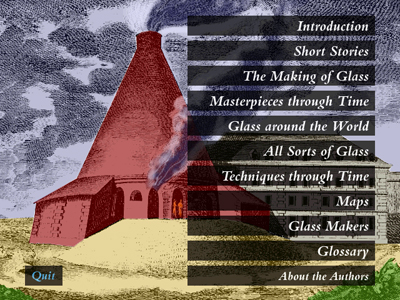
Fig 2: Cone screen
The navigation is centred on the main or cone screen. It was referred to as the cone screen because its background illustration is derived from an 18th century illustration of a glass-making cone furnace building.
The cone screen offered a set of choices, taking you to the main choice screens from which typically you reached a set of glass objects characterised by the choice. One of the main principles behind the interface design was that you should be able to find a glass object fairly quickly, no matter what your specific interest. Individual glass masterpieces were never more than three clicks away.
Even with such a flat hierarchy you still need to be able to get back. We used icons at the bottom of the screen which appeared as you moved through the hierarchy of screens from the cone screen to a choice screen to an array of thumbnails and then to an object screen. Each screen was represented by an icon, designed by making reduced versions of the screens, large enough so that they could be recognised and touched. These would now be called crumb trail icons. At that point they had been used, as far as we know, only once before, and that was in a product we had made for Apple Europe for negotiating a managers’ conference: we also used large icons at the bottom of the screen as a way to navigate through the information. This navigation scheme worked very well.

Fig. 3: Glass Around the World choice screen with crumb trail icon
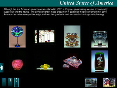
Fig 4: United States of America thumbnail array with crumb trail icons
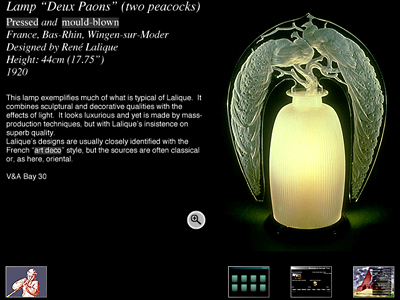
Fig 5: Lalique lamp “Deux Paons” (two peacocks) object screen with crumb trail icons
The screen size was the then typical standard 640 x 480 pixel screen (Cotton 1997).
One of the things decided early on was that conveying the quality and the colour of the glass was very important. We wanted to convey the rich colours, the quality, and the detail of the glass masterpieces. In order to make this happen we set everything against a black background to enable the eye easily to see the colours and the nature of the glass.
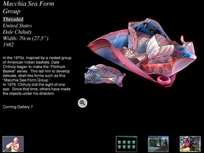
Fig 6: Dale Chihuly Macchia Sea Form Group object screen
We also wanted to use white text on this dark ground. At that time there was no way to get anti-aliased text on the screen within the interactive software. We wrote a tool called TextPac, which anti-aliased the text as it came to the screen. This development meant that live text looked good, and was far easier to read. This was important to us in terms of acceptances by the gallery visitor. With so few pixels available on the screen, we really wanted the best we could deliver. In 1993, very few fonts had been designed for the screen. We used Caslon for the headings, which were all created as ‘painted graphics’, and, though originally we wanted to use Gill, in the end we used Helvetica for the live text.
All of the screens were carefully laid out to work on a strict formula, similar to today’s style sheets, such that everything appeared in standard positions on all the screens. This was considered important, enabling the user to concentrate on content, rather than leaving people wondering where things were, or why things looked different. A very simple, effective style template was used to achieve this.
Production
Text
The V&A already had a Collections Management System, as well as other forms of collections information, but the descriptions were not designed for the visiting public; they were intended for curatorial use. The descriptions needed to be re-written for a public audience.
We knew that if you display large amounts of text on screen nobody reads it, so one of the parameters that we recognised was that each description should be limited to about 70 words. This initially caused consternation amongst the curators.
However with careful breaking up of key aspects, it became possible to write short texts which were interactively related and therefore gave enough space for the curators to include the required level of information. For example, a glass object would be described in one text and interactive related to a text describing the maker of the object.
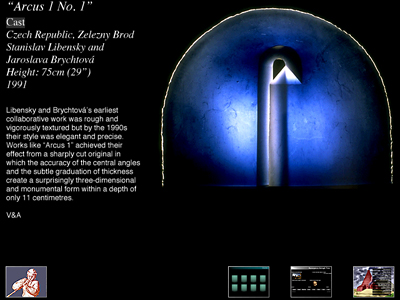
Fig 7: Libensky’s “Arcus 1 No.1” object screen
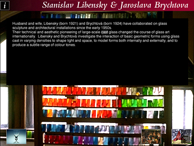
Fig 8: Libensky’s maker screen
Glossary
We introduced the notion of a fully interactive glossary (Whitehouse 1993) so that the curators could use specialised terminology, which, rather than excluding the general visitor from the content, actually opening it up to a wider audience.
The glossary appeared at the bottom of the screen when a hilit term was touched. It could be dismissed, but it was also a continuous glossary. If a description of one term included another specialised term, then that was hot text which you could pick, and it would give you the next glossary entry. If any of the glossary entries were describing things for which a video had been created, then a video icon appeared, to show that there was some video available. This was one of the first uses of video icons.
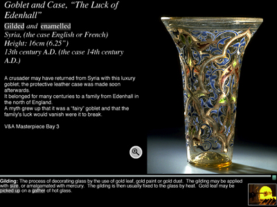
Fig 9: Luck of Edenhall with pop-up glossary with video icons
Multiple Languages
The Story of Glass is a multiple-language application, holding completely different text files for UK and American English versions. It had been decided that to have one or the other, or, even worse, a strange unresolved amalgam of the two, would be unacceptable.
In the installed version the choice is made behind the scenes, but on the CD version it was done at the install point, so that you could choose between American and British English.
One of the big advantages with the way the Apple Media Tool, our chosen software platform, worked was that it enabled us to develop this dual language application.
Video
The association of video of glass making techniques with the objects themselves was important to provide an understanding that when a technique was being demonstrated, it was actually related to a particular object in the gallery. Being able to keep these things together was a key advantage given by interactive multimedia
We collaboratively produced a definitive list of glassmaking and decorating techniques, which in many ways was correlated to the list of glass masterpieces. The principle was that we were telling the story of glass and glass-making, and therefore it was vital that every important technique should as far as possible be included. The list divided into five main sections: ingredients for glassmaking; the material substance and properties of glass; glass-blowing; and decorative techniques. When it came to making the actual videos we were fortunate in being able to work with Bill Gudenrath, a glass-maker and teacher of considerable standing, who has had a long association with the Corning, and at that time was working in New York. We arranged to direct the shoot by phone across the Atlantic, with Bill and the video crew working in his studio. The main instruction was, ‘pull in close to the detail - remember this is only going to be quarter-screen’!
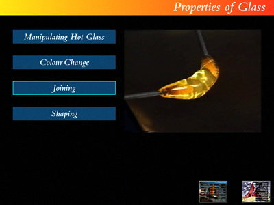
Fig 10: Properties of Glass video screen
We also worked with Bill in the creation of the text movies which ran in association with the visual movies, describing what was going on. An early decision had been made by the V&A that the kiosks in the gallery were to run silently, but when we had the opportunity, the following year, to create a published CD version of The Story of Glass, we inveigled Bill into coming to an audio recording studio during one of his visits to London, to record voice-overs to the edited movies. One of the marvellous aspects of working with Bill on this project was that he has made the study of Roman glassmaking one of his specialities, and he has also de-mystified the tightly controlled secrets of Muranese glassmaking.
The quality of the video was of utmost importance: at that point the largest video you could get on-screen at acceptable quality was 320x240 pixels, and the fastest you could get it off a hard disc was about 240K per second. Also at that point there were only a few codecs that could compress movies effectively; we in fact used CinePak. There were real technical restrictions on the video quality you could achieve on the screen.
The video was shot on Hi-Band U-Matic, and was then transferred to Video 8. It was then digitised. This required the purchase of a very expensive video board to digitise it into the Mac. The editing was also an extremely lengthy process,
mainly because everything took a very long time to render. Typically one minute of video took an hour to render on the fastest machine then available. One of the videos of a particularly complex piece, a dragon stem goblet, was 12 minutes long.
We used Adobe Premiere as our editing tool. To work out the best way to compress the video a lot of trialling was done, in conjunction with Peter Bratt, who as one of the founders of the BBC’s Interactive Television Unit had great knowledge of video and the requirements necessary to achieve high production values.
Bill Gudenrath has been a very close observer of how glass is made, to the point where those who wish to keep some of the glassmaking methods secret would rather not have him watching. Bill was very keen to share this knowledge, and indeed, one of his conditions for shooting the video was that we didn’t edit in such a way that you couldn’t see clearly how the techniques were achieved. This didactic purpose is critical to the success of the whole of The Story of Glass.
Bill created the glass objects and showed the techniques in such a way as to make them clear to the public. The video was shot to complement this and, in consequence, those pieces of video still stand up as very clear explanations of how certain glass objects are made. Even now in the Corning Museum, where they have a glassmaking facility where people can both watch glassmakers and have a go themselves at making glass, The Story of Glass and its videos are still watched, Very often because visitors want to see exactly what goes on in the making of an individual glass object. The videos are very specific about particular techniques and about particular objects. Live demonstrations can’t always be so skilled. In The Story of Glass, there was no extraneous use of video; it was used solely for showing the techniques. It is one of the factors in the long-term success of the installation. The videos are still vital, vibrant, and relevant.
Images
The selection of images was informed by a number of questions. How many objects were visitors likely to look at? Should we include all the star items from each collection? Were there pieces to illustrate every technique, historical period, significant glass-maker, glass-making location? The very high quality exemplary pieces, both in terms of quality of production and overall design, were selected, reflecting the superb content of both collections.
The two curators selected the objects to be considered and delivered to us images of those objects. We digitised them using the best method for high quality results at the time, PhotoCD. We treated these images in Photoshop to maximise their quality and to remove dust spots, etc. A process of colour correction was carried out, and a final colour correction occurred when the photographer from the Corning came over and we sat together and went through all of the Corning objects to get absolute colour matching.
Other Key Content Elements
Maps & Timeline
In the beginning we had high hopes for the didactic and illustrative use of maps in the project. There are special difficulties when you are dealing with an historic collection where you have references to the places objects were made, and those places have changed their names or have changed the country they are in. This creates problems for curators in knowing how best to label their collections to make them both correct and accessible to visitors. We wanted to be able to show good maps of where things were made so that visitors would start to understand where the significant glass-making places were and had been. Unfortunately, it was difficult to obtain high-quality maps for the right price. The project would have been more effective if they had been available for use.
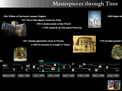
Fig 11: Timeline screen
Seeing things through time was another aspect we felt was important. Now we could create a dynamic timeline driven off the collections management data conjoined with external key events information.
Stories
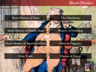
Fig 12: Short Stories choice screen
Another section dealt with stories of the social history of glass. Most were produced as slide shows with accompanying texts.
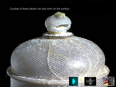
Fig 13: Glass disease story
Some could be unpacked by the visitor picking different elements in an image.
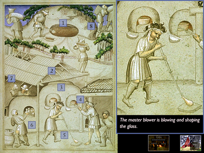
Fig 14: Bohemian glass houses
This is an area which could be more significantly developed now. In this section we were able to use a piece of film footage, probably from the 1950s, showing the dramatic process of changing a pot in a glass furnace. We were also fortunate to be able to include film material from a documentary entitled The Glassmakers of Herat, filmed by one of the people at the Corning Museum on a field trip some years previously in Afghanistan. Such historic pieces of film footage immensely enhance new media productions.
Software
The Apple Media Tool had been chosen as the software platform for the product in the first place because were wanted to be able to handle all of the data in the system in databases, rather than hand crafting each screen. At the time the only application that afforded this was the Apple Media Tool.
Our databases were essentially just flat-file databases, allowing many databases to be loaded into the system. When the application is started, it loads in a series of different databases which it can then use to deliver the final information.
The text data for the Apple Media Tool was held as text files which could be checked, altered and edited as texts, making a real difference in efficiency during the production phase. The content was therefore kept separate from the programming architecture. Not only the text files, but also all of the images, and any video, audio etc. were all kept separate so that the content could be prepared and delivered to the highest possible quality without having any impact on the programming. Neither one was dependent on the other in terms of a how they were developed.
Production Database
As part of the project management we used a production database made in FileMaker, and holding all the pertinent information about the media components: what was needed; what we had; where things were; and what state they were in. This production database formed the project’s ‘bible’ and enabled us to generally maintain order; to determine what media were missing at what point; what was awaiting correction; what had been finally approved. This keeping order and overall control was vital because with the vast numbers of media elements we were dealing with, it was certainly not possible to keep it all in your head.
Testing
Once we felt The Story of Glass was complete, we installed it in the gallery. We spent three weeks before its official launch testing it. This meant we were able to de-bug it thoroughly before it was launched. The museum was naturally nervous about having the general public use a system which might break. However we ended up with a very stable result, so stable that no change to the software has been needed since it was launched in 1993.

Fig 15: Original kiosk in the Victoria and Albert Museum
Users And The Tracking Mechanism
We installed a tracking mechanism which operated behind the scenes in the software architecture. This enabled us to analyse where people had journeyed through the application. It was the equivalent of the sort of statistics packages that are now used for Web sites. Initially it was a bug-tracking mechanism, but it also enabled us to carefully investigate how people were using the system. This tracking mechanism was used to provide comparative data when Surrey University conducted a survey observing the use of The Story of Glass at the V&A (Breakwell 1995).
Fig 16: Visitor using the kiosk
We found that it was possible to match the observed usage of people with the tracked usage, and that by co-ordinating these two we could see exactly what each individual had been doing, and how much time they had spent there. It was through these investigations we discovered that gallery visitors were using the system for much longer amounts of time than we had anticipated. Typical times were 10 - 15 minutes, but there were instances of people using the system for over an hour. We also recognised that docents were using the system to find out more about glass before guiding groups through the galleries.
Interaction Within The Gallery
The Story of Glass fulfilled one of its key intended functions, enhancing visitors’ experience by enabling them to relate the glass pieces in the cabinets with the techniques shown on video in the kiosks. Also users have been able to move between The Story of Glass and the objects in an iterative fashion, greatly enhancing their experience. In consequence visitors have engaged more deeply with the collections.
Fig 17: You can move easily from object to kiosk
Long Term Success Of The Design
The design was kept as simple as possible, with no extraneous material. One of the reasons for this simplicity was an awareness that the potential museum audience, at that time, was unlikely to be computer literate, and therefore might have stumbled around an over-complex interaction interface.
We were delighted with the post-installation survey which identified that approximately 94% of visitors found The Story of Glass easy to use; this really was gratifying.
As an on-going success it’s highly significant that not only did it prove to be easy to use then, but it has also continued to have a significant role within both collections today.
The original design for The Story of Glass had it operating on kiosks where users stood. The Corning Museum decided that to one of the kiosks they would add a large extension monitor, high up above the kiosk. This was situated in an area where you could assemble an audience of around 45 people, a typical tour or school group. Someone could show items in The Story of Glass, and the media product would appear on the large monitor where the whole group could see it. This was used especially for schoolchildren who reacted well to both seeing items in this way, and exploring things themselves, demonstrating to their classmates, and thus enabling real discussions to be generated. The value of such an educational discussion around a resource of this nature has indicated one of the real successes of the Story of Glass: deep cognitive communication with its audience.
Key Recommendations
When we were putting together The Story of Glass there were very few models for appropriate content architecture available (Howard 1986, McHale 1987, Masterman 1970). Literature, film and media were the only real sources of potential morphologies and metaphors (Borges 1970, Eco 1983, Fuentes 1977, Pynchon 1973). Most interactive media works had either been experimental or been designed to work on CDROM. Very few kiosks were then apparent in museums, and museums did not have Web sites. This meant that we had to go back to first principles to create the architecture and content. This was a good thing and something which tends not to happen now. People pick up standard models and just use them.
Here are our recommendations for creating memorable and long-lasting interactive media products.
- Start the creation of your content architecture from first principles.Looking at how your content has been traditionally structured, conjoined with use of structures from other contexts, can help to build the most appropriate structure for your content and context. This can often be aided by the judicious use of significant metaphors. But remember that is it’s always your model users that you must have in mind.
- Become sensitised to your subject.In the creation of The Story of Glass, because we began at the beginning, we spent a lot of time considering the nature of the content, not just its structure. We became familiar with the world of glass, we learnt about its history, its techniques and the way it had been collected by museums. In doing this we became sensitised to the subject.
- Be enthusiastic about the subject. If you are not, it will show.Many products become dull because nobody is championing them. Get to the heart of your content.
- Be creative.Too many interactive media products have become tedious whilst trying to comply with standards. There is a need to recognise the tensions between creativity and standardisation in order to create superlative products.
- Use scenarios.Imagine how somebody might use your product and write out the scenarios for different potential users. Then use these to check whether the design allows this use. On completion of the project, use these scenarios as your first testing procedure.
- Keep a balance between the scope and the level of detail you need.Giving visitors both an overview of the scope of the subject and enough rich detail to deeply involve them as they dig more deeply into the content is vital if you want them to return regularly.
- Create your own audience.Of course it is good to address a known audience, but the aim of a good product should be to create its own audience. It should do this by gently expanding the range and depth of the product in ways that enrich the experience.
- Understand your aims and don’t be afraid of them.Recognise that your aims may be different from others, but it is vital that they be clearly stated and that everybody understands them. Then make sure that they flow throughout the project. Don’t be afraid of the consequences.
- If you want to be didactic, be didactic.Typically we visit museums because we want to learn and understand more. So if your aim is to be didactic, be didactic: but remember to use the excellent communication skills the good teacher deploys.
- Voice the content appropriately.The voice in which content is delivered is very important and part of how you create your audience. A patronising tone or highly specialised language can be a disaster.
- Always employ good quality design.The overall architecture of a product is the first thing that articulates your content, but the careful use of interaction, media, colour, typography and visual space are also important if the product is to fulfil its expectations. Poor quality design reflects badly on both the product and its originators.
- Remember, good quality design takes time.Design should start at the inception of a project and should permeate the whole. It is not done overnight. It needs time and iteration to be refined and completed.
- Always use the highest quality production values for media.Media quality and therefore the expectations of quality will keep improving; therefore it is vital that all media are prepared to the highest possible quality. This means full production values, like careful editing, etc., not just technical quality. Maintaining your media at the highest quality will allow you to re-use parts in the contexts of the future.
- Use all media appropriately.Different media types convey different information. If you want to explain how something looks, then show it in an image. If you want to show how something is structured, then show it in a diagram. If you want show something in process, like an object being made, then use video. Your message is not determined by your media, but the rhetorical quality of your message is. Some media are much more evocative than others. The use of sound and especially voice can be very engaging.
- Keep text lengths sensible for on-screen reading; put long texts elsewhere.Think very carefully about your text. Long lengths of text are not readable on screen. This means restructuring your content so that the text can be broken into appropriate pieces. Using downloadable longer texts (as pdfs) can help.
- Use hypertext effectively.Many things require more explanation and have rich histories. If you try to put this all in one body of text, people won’t read it. Hypertext affords the real possibility of creating significant cross-references, access to glossaries, and in- depth discussions using the specialist terminologies of the subject.
- Make the most of context.If the interactive media product is running on a kiosk in a museum, then make sure that the content relates as closely as possible to the objects around it. A visitor should want to look at an object, look at the screen, then look at other objects, then back to the kiosk and so on. If your product is on the Web, then remember the context of the Web and the effective interactions with other sites; but also remember that the context for the visitor is home or office and you are talking to them one-to-one.
- Use databases to hold your content.You may use content in many places and for the production of different media outputs. You want to edit it in only one place. Keeping it in a database allows this and means that its integrity is maintained. It also means that the content can always be edited and kept up to date, and multiple language versions can be maintained.
- Try to keep your content separate from your design.Designers and authors are different beasts and they work with different constraints. Although the way things look and are said both change over time, visual fashions tend to change faster. Being able to change the design separately from the content makes responsiveness easier.
- Use style sheets.Moving as much of the design out into style sheets helps enable changes. But it also helps to keep the content well structured if changes are made globally.
- Remember, most people don’t start at the beginning.This is where Web sites differ from kiosks. Kiosks typically start at the beginning, but because most people reach Web pages via a search engine, they start on any of your pages. This means every page needs to enable the visitor to reach any other page in as few actions as possible.
- Effective navigation is everything.Without a good navigation scheme, nobody will move around your product. It needs to be simple, memorable and consistent. But don’t forget that navigation doesn’t just have to be by menus. By using hypertext effectively, you can encourage visitors to view more than the first place they land on. Encourage slipping from one world to another, from one domain to another.
- Participation is cognitive and emotional, not merely manual.Participation such as visitors entering comments or information can be extremely useful and interesting, but remember that this is only part of the story. Real participation is cognitive and emotional; it is about understanding and engagement.
- Searching needs to be fast and accurate; browsing needs to be articulate.If your customers are experts, they will know what they are looking for and will want to go to it directly; they will want to search (but remember searching is hell on touch screens). If they are non-experts, then they will need to browse to get the sense of what is available and find simple paths to get to things that interest them. Users frustrated by poor search results soon stop being visitors. Good searching can be enormously enhanced by the use of good thesauri, terminology control and auto-indexing systems. Browsing schemes and the words used to describe sections need to be carefully thought through and the words refined for the intended audience. Articulate use of language is vital. The semi-private languages of the in-house specialist can be a disaster.
- Make your product memorable.The experience of the product and the product itself should be memorable. This means that an idea of the whole needs to cohere in the mind of visitors so that your product is a natural destination if they want to consider the subject again.
Works Cited
Borges, Jorge Luis (1970). Labyrinths, London: Penguin
Breakwell, G.M. and H.M. Wright (1995). The Glass Gallery: Supplementary Report Electronic Information System including “The Story of Glass”. Guildford: University of Surrey.
Cotton, Bob, and Richard Oliver (1997). Understanding hypermedia 2000, London: Phaidon .
Eco, Umberto (1983). The Name of the Rose. London: Secker and Warburg .
Eco, Umberto, (1984) Semiotics and the Philosophy of Natural Language. London: Macmillan.
Fuentes, Carlos (1977). Terra Nostra London: Secker and Warburg.
Howard, Graham (1990). Renaissance Project. Wheels for the Mind. Vol. 5, No.1, Uxbridge: Apple Computer.
Howard, Graham (1991). 7th Annual Apple University Consortium Conference Proceedings. Multimedia by Design: Shakespeare, Paris, Apple Computers.
Howard, Graham (1986) & Karamjit S. Gill. Artificial Intelligence for Society, Art and Design: AI and its Consequences Chichester: John Wiley & Sons.
Masterman, Margaret Imre Lakotos and Alan Musgrave (ed.), (1970). Criticism and the Growth of Knowledge, The Nature of a Paradigm. Cambridge: Cambridge University Press.
McHale, Brian (1987). Postmodernist Fiction. New York: Methuen.
Pynchon, Thomas (1973). Gravity’s Rainbow. London: Jonathan Cape.
Watson, Oliver (1997). The Story of Glass. Computers and the History of Art, Vol.7, No.1. Amsterdam: Overseas Publishers Association.
Whitehouse, David (1993). Glass: A Pocket Dictionary of Terms commonly used to describe Glass and Glassmaking. Corning, New York: The Corning Museum of Glass.
Yates, Frances (1969). The Art of Memory. London: Peregrine.
Cite as:
Beecham S. and Howard G., The Story Of Glass: Still Really Working 10 Years On, in J. Trant and D. Bearman (eds.). Museums and the Web 2006: Proceedings, Toronto: Archives & Museum Informatics, published March 1, 2006 at http://www.archimuse.com/mw2006/papers/beecham/beecham.html